PF Dekka Mono Pro


PF Dekka Mono Pro
Copyright ©2015
Designer: Panos Vassiliou
Copyright ©2015
Designer: Panos Vassiliou
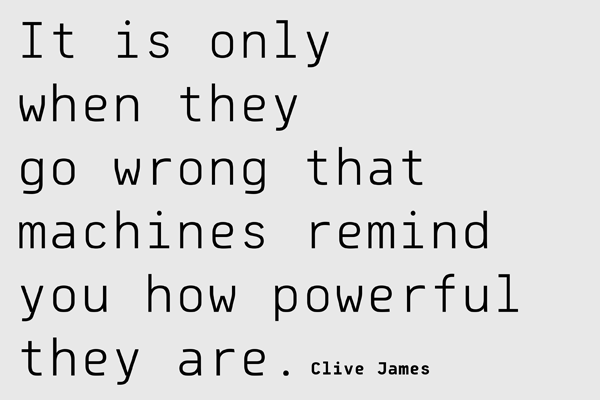
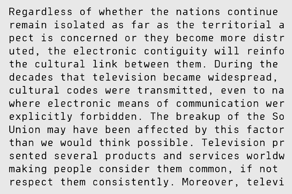
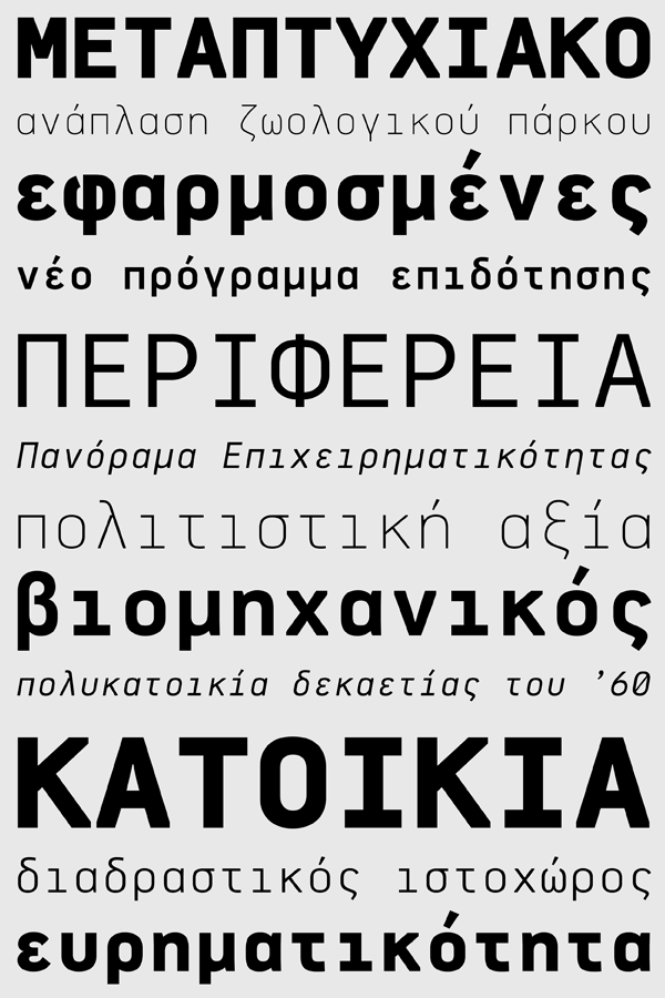
Dekka Mono was based on its proportional counterpart Dekka Pro and is comprised of characters with fixed width. The spacing attributes of the glyphs were redefined and legibility was further improved by revising the shape of the letterforms. Kerning was not included in order to preserve the monospace nature of this typeface. The origins of Dekka trace back to the first Mac operating system and its standard Monaco font but its letterforms divert from the stiff mechanical structure of the original model and have evolved into curves which are familiar, softer and easier to read. One of its main features is the trimmed diagonal stems/strokes but includes several other distinct characteristics which are reminiscent of the old OCR devices. It is recommended for branding, music, fashion, sportswear, technology startups and socially active individuals. The family consists of 12 weights ranging from Thin to Bold (including true-italics). It provides simultaneous support for Latin, Cyrillic and Greek.


